FocusBuddy: Enhancing Productivity Through Mindful Design
A productivity app designed to help users maintain focus and manage their time more effectively through a minimalist interface.
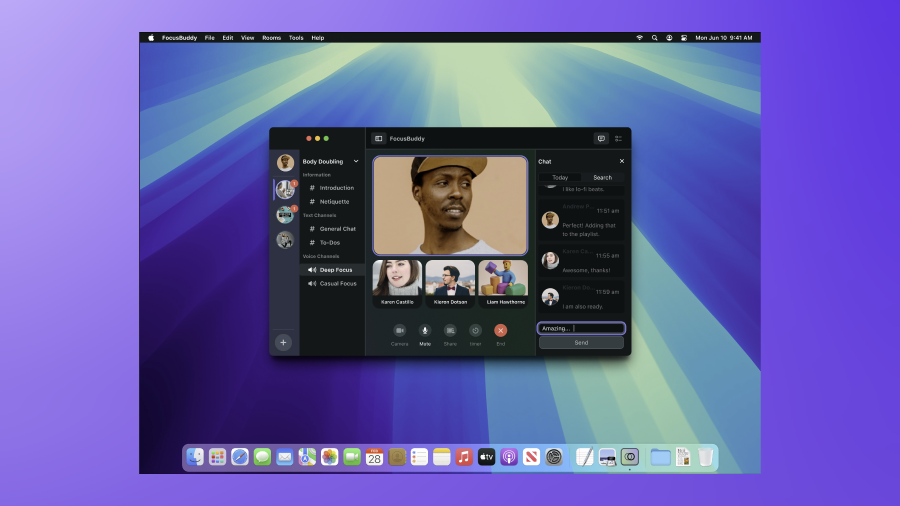
FocusBuddy is a productivity app concept designed around a single principle: the interface itself should never become a source of distraction.
In a world of constant digital interruptions, FocusBuddy provides a structured, calm environment for deep work. Every feature decision was tested against one question: does this protect the user’s attention, or compete with it?
Thoughtful Features
Every element is designed to support sustained attention, not fight for it.
Adaptive Focus Timer
Custom intervals that learn from your session history to recommend the optimal work rhythm.
Minimalist Task Engine
A ranked list that declutters with a single swipe, surfacing only what matters today.
Calm Analytics
Dashboards that celebrate progress without inducing anxiety, focusing on focus trends.
Mindfulness Micro-Breaks
Structured breathing and movement prompts designed to sustain energy across the full day.
The Design Process
From deep research into focus failure to a minimalist prototype.
Research & Discovery
Conducted 20 in-depth interviews to analyze patterns in digital focus failure.
Defining Tensions
Synthesized research into three core points: task overload, notification noise, and energy depletion.
Competitive Benchmarking
Evaluated 12 apps to identify UX patterns that induce stress vs. those that support calm.
Concept & Prototype
Tested three metaphors (notebook, garden, stopwatch) before selecting a minimalist direction.
Visual Identity
Established a "soft focus" color system and spacious typography for an uncluttered feel.
Usability Testing
Iterated through 2 rounds of testing to refine onboarding and the break-frequency logic.
Minimalism as Power
"Most productivity apps fail because they become sources of distraction. Removing features was the hardest, but most effective, design decision we made."
Design Language
Crafting a mental space for high-performance deep work.
Neurological Colors
Muted blues and sage greens chosen to reduce cognitive load and promote calm.
Negative Space
Generous margins ensure the UI "breathes," mirroring the mental state we want for the user.
Haptic Choreography
Distinct vibration patterns for session milestones, reducing reliance on visual interruptions.
Project Outcomes
Validating the impact of a minimalist focus on productivity.
Frequently Asked Questions
Understanding the philosophy behind minimalist tool design.